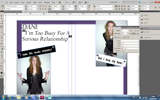
The first step I did was place the two images I'm going to use into Indesign.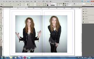 The next step I did was position the photo's where I wanted them and also set the background colour.
 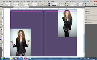 The next step I did was put the appropriate quotations next to the photo's on the document. To make the boxes around the quotations I clicked the 'Shape Tool' and drew a rectangle shape for the quote to go in.
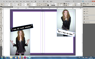
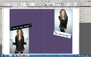 Before writing the actual interview I thought that the text wouldnt show up very good against the purple background. However I still didn't want a bland white double page spread. So i decided to draw a a white box with the purple background, so that way the text would still be clear but also I have the edgy purple colour.
 The next step I did was position the photo's where I wanted them and also set the background colour.
  The next step I did was put the appropriate quotations next to the photo's on the document. To make the boxes around the quotations I clicked the 'Shape Tool' and drew a rectangle shape for the quote to go in.
 Before writing the actual interview I thought that the text wouldnt show up very good against the purple background. However I still didn't want a bland white double page spread. So i decided to draw a a white box with the purple background, so that way the text would still be clear but also I have the edgy purple colour.
  The next step I did was insert the headline to the spread. For the headline I used the font Times New Roman and the size was 60.
 This is what my spread looked like with the headline on the page.
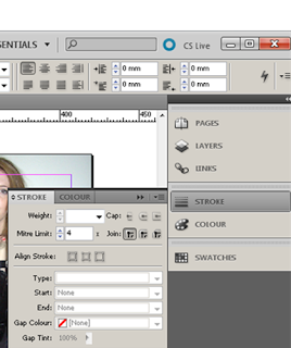
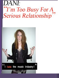
 I then decided to change the colour of the text in the headline and also one of the quotes to give a wider variation of colour to the spread. To change the colour of the text I higlighted the text and pressed the stroke tool and changed the colour to red.
 This is what it looked like with the change in colour.
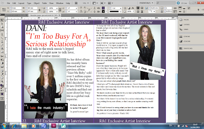
After that I wrote and inserted the interview, this is what it looked like after the text had been inserted.
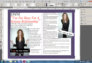 Around the purple boarder I decided to add some text to frame the spread. This is what it finally looks like.
No comments:
Post a Comment