Tuesday, 3 May 2011
Audience Feedback of Final Magazine
Comments from Audience 1
"I like the colours used throughout the magazine. I also feel as if I can look up to the artist featured. The colours andn artists the rock genre really well, but I dont really think I can see how Indie music is incorporated into it"
About Audience 1
Her name is Fiona, she is 17, loves going out to gigs,favourite music is indie/alternative music,lives in a small town.
Reflection on results from Audience 1
I asked Fiona to look at my magazine and fill out my feedback sheet because she's the type of audience that i'm aimed my magazine at. From these results I've found out although I incorperated the rock genre into my magazine, I havent done as much for Indie. I think that the style of my magazine (colour, masterhead) is in style as a rock magazine, however the artricles that it features focuses on both genres. Fiona also agreed that my front cover was the weakest element of my magazine, I'm disapointed in this because I feel as if I tried so hard to try and make it work, but I don't think it looks as professional as the other elements of my magazine. However she did say that she liekd tthe artist and felt that she could look up to her, I think that is a good result bercause many girls need role models to look up to.
Audience 2 Comments
"I love the conents and double page, because they look like you would actually see them in a proper magazine. The front cover is alright but I think its the colour or something that just isn't right with this front cover. I like the contents page becaue it actually made me wanna see some of the magazine articles, and I really like the interview because she seems like a well cool girl. But yeah overall I think its good."
About Audience 2
His name is David and he is 23, he lives in a small town, goes out clubbing and also is going to festivals this summer. Rock and dubstep are his favourite genre's music.
Reflection on Results from Audience 2
I decided to ask David for feedback because although hie like dubstep, he still liked rock msuic and is 23. This gives me the chance to find out about what people think who also have other music intrests and also in a higher age band. He also thinks that the front cover is not as strong as the other which I already know, but at least it shows that its not just me thinking that it doesn't look right. I think if I had more times I would definitly change my front cover. He talked about how he liked my contents page because it made him want to read the articles. This is good because thats what I wanted from the contents so that intrigues the audience to go and read the artcles. He also said how he like the artists, this is good because I wanted her to look edgy but also approachable and rewlatable to the audience.
Overall thoughts
Overall I think that although both audience aggreed that the front cover wasnt at the strongest, they both thought that the artist was relatable in some way. They also agreed that the text is as if they are talking to a friend and also think that the magazine represents the rock genre well, but maybe should incorperate the indie genre more. Overall I'm pleased with the feeback that I got because it helps me realise that what I've done wrong and understand how I could improve my magazine to be the best that I could make it.
Monday, 2 May 2011
Looking back at your preliminary task, what do you feel you have learnt in the progression from it to the full production?
When I first started my preliminary I carried out rough research inot collge magazines, however when I researched into music magazines I felt as if I actually used that information whilst I designed my magazine.
I feel as if I’ve learnt how everything that you use in your magazine e has to be there for a reason, whether it to be to represent something/someone, to advertise or to make it seem more professional, everything in a magazine is put there for a reason, one way or another.
With my preliminary I designed in Publisher because that’s the only programme I knew how to work and therefore I don’t think it looked as professional or was a s effective as my music magazine. The images where taken without any planning behind them, unlike with my shoot where I planned location, costume, set, lighting, costumes and poses beforehand. This is why my magazine turned out looking more professional also.
I’ve learnt that it’s so important to how you address your audience and how to make the reader feel certain emotions. I addressed my audience as I was talking to my friend, this made the reader feel as if they were talking to someone they could trust their opinions on, therefore would allow to give ideas to the reader about certain music artists.
I’ve learnt that although you need to make your magazine look interesting and original you need to make it easy to read to the reader. Because there’s no point in doing a really complicated Masterhead if the reader can’t read what it says. I’ve learnt to find the line between being simple and also being too complicated.
I've learnt how important it is to build up your brand name. I've learnt that its all about the brand and once you build up a reputation for your brand then people will recognise it and it will become stronger and stronger.
The preliminary helped me learn from the mistakes that I made and instead of focusing of what I did wrong, use those mistakes and think ‘what can I do next time to prevent that from happening’. The preliminary helped me get prepared to the task ahead. However I feel that with the preliminary I designed it the way it thought it looked nice and worked well, instead of the way I though the reader would like and would represent certain themes and ideas well.
I also learnt was how magazine institutions work and which company’s distribute which magazines. This helped me because it helped me realise the industry and understand how the process works.
What have you learnt about technologies from the process of constructing this music magazine?
When we first started the project we did a rough workshop which gave me a overview of both InDesign and Photoshop. Before then I had never used either programme before in my life, so I was interested and enthusiastic about using them both.
So at first I knew the basics but it wasn’t until I actually started editing I learnt about the different tools on both programmes. In Photoshop I learnt that you can change pretty much everything on a photo. The main features I used on Photoshop where the magic eraser tool and the paint brush. Both of these features enabled me to get the right effect that I wanted on the images I used and the Masterhead.
In Indesign I learnt how to edit text and rearrange them into any style of shape I wanted. I liked this because it enabled me to achieve the elements of my magazine which I probably wouldn’t of been able to achieve in any other programme.
Overall I have progressively learnt throughout this project how to use this technology. I started with the basics and have progressively got better and better at editing and creating elements with pictures and documents it has also given me an insight to how magazine editors create magazines and how much work goes into creating every little detail.
How did you attract/address your audience?
I addressed my audience informally. I did this so that it would seem as if the people writing the magazine are just like the reader and makes them seem more relatable. In the interview I asked questions that I knew the audience would want to know about the artist. For example ‘Have you got a boyfriend?’ instead of asking something like ‘what do you think about the current economic situation’ because I knew that’s not what the audience would want to know.
Who would be the audience for your music magazine?
What kind of media institution might distribute your music magazine and why?
Bauer media- This company distributes mojo magazine which is a alternative music magazine which is quite similar to indie music therefore I don’t think will distribute. IPC-Distributes the very popular NME magazine which is also a rock/indie magazine which would be our main competitor, therefore wouldn’t work to be competing in one company. BBC- Even though the BBC doesn’t have any magazines which are rock/indie magazine I think that my magazine wouldn’t be appropriate for the BBC brand.
I think that the company Emap would distribute my magazine because Emap distributes many magazines and the only younger audience music magazine that they distribute is smash hits, I think that they would distribute my magazine for it would fill their niche in the company.
How does your music magazine represent different social groups?
In what ways does your music magazine use, develop or challenge forms and conventions of real music magazines?
I think that my music magazine uses the conventions of a music magazine and also challenges them. I used the normal conventions for my music magazine to make sure that it looked professional. I used conventions such as:
· Masterheads
· Editors letters
· Headlines
· Music Interviews
All of these typical conventions I used in my magazine. Along with these conventions I wanted to make sure that I put my own ideas into my magazine.
Front cover
In the front cover I think I challenged the typical music magazine conventions by having a quote of the artist with a swear word in it on the front page. Although I obviously edited it out the swear word so that you can only see star texts in place of the actual letters, however many music magazines would not have that on their front cover. The reason why they wouldn’t is because many people wouldn’t approve of that being on a magazine, and it may be controversial, which is why is decided to put that specific quote on there. It seems rebellious, controversial and risky but that is what my magazine is about, which is why it fits so well.
I developed the conventions of a music magazine because all music magazines obviously have a Masterhead, however not many music magazine shave slogans. Although I have seen them on other magazines, I think that this magazine is one of the very few that do have a slogan on it also. I choose to do this so that it will improve the ‘R&I’ brand and make it stronger.
Contents
I think that I followed an easy structure and went with the normal conventions of a music magazine with my contents page. I did this because on the first page I was risky and wanted to play it safe. Also I feel that the contents page shouldn’t be too busy or have anything complicated on it because it’s supposed to be a page that the reader can quickly glance at whilst moving through the rest of the magazine.
Double Page
For my double page spread I mainly stuck with the standard conventions of a music magazine, the reason I did this was to mainly focus on the artist. The front cover challenged those conventions so that the readers when picking it up thought that this was something new and fresh therefore I think that once the audience has picked up the magazine I should play it safe, as I’m appealing to the teenage years to late twenties therefore some of their parents/guardians may not approve.
I however did develop the conventions by instead of just having pictures of the artist; I had pictures of the artist with matching quotes beside them. Even though these did not necessarily meant to go with those quotes the pictures portrayed the overall emotion of the interview without the reader having to read the interview.
Evaluation of Final Double Page Spread
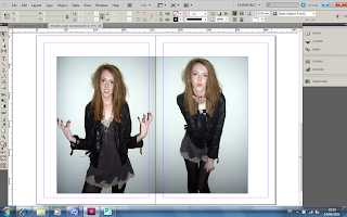
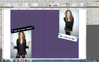
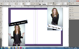
I knew when I was planning that I wanted to sue contrasting pictures in the double page spread. The reason why I wanted contrasting pictures was to show two sides of the artists and to also give the feature more variation in emotions. The images clearly represent the emotions of the quotes which are beside it. This is done in many magazines because sometimes the image may not be about that quote but they complement each other well that’s why they use them. The first image is of her looking annoyed and frustrated; you can tell this by her angry facial expression and pose. The contrasting image is of her blowing a kiss to the camera. These contrast in love and hate. By having the quotes ‘I hate the music industry’ and ‘but love my fans’ it makes the reader think that she is just an ordinary girl who isn’t into the music industry but loves her fans. This will make the readers who are fans feel special ad more important than her career.
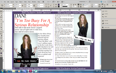
I experimented with colours and styles to make sure that I again represented the artist’s personality and emotions correctly. I edited the word ‘hate’ in the quote ‘I hate the music industry’ to a red colour with an underline. By doing this it created emphasis to the word and the colour red represents anger which I think would show how much the artist hated the music industry. The colour of the border is a dark purple colour, the reason I used this colour was because it matched the colour of Dani’s dress and also the colour purple is an edgy colour. The reason its edgy is because the colour purple is a girly colour but because this is a dark purple it makes it seem less girly and more tomboy. In the border I inserted the text ‘R&I Exclusive Artist Interview’ into it, this makes it more official and show that ‘R&I’ is the only magazine to get this interview with her.
When writing the actual interview I decided to have the headline as a quote from the interview. This will give the reader a sneak peak to the interview and make them want to read more. When I wrote the introduction to the interview I wanted to create a rough overview of the artist. For the actual interview I wanted to differentiate the text between the interviewer and the artist. For the interviewer I had the words in bold and the artist in normal text writing.
Evaluation of Final Contents Page
I started the contents page with an editor’s letter because I wanted my magazine to be very personal to the reader and feel as if they’re personally being welcomed into the magazine by the editor. To show that the editor really cares and didn’t just type a letter up on the computer I put the editor’s signature at the bottom which made it seem even more personal. To advertise the magazine subscription scheme at the top of the letter I inserted a small advertisement. By having it the advertisement saying that if they subscribe they receive a free gift, it encourages the reader to buy it because they are getting the subscription and a free gift. To highlight this offer I edited the word ‘free’ into upper case letters to make it seem important.
I used three images at the top of the left side of the page which showed sneak previews of what’s in the magazine. The first image of Dani shows that she is fun and shows that this magazine is a fun and relaxed magazine. The images of the ipod and guitar represent this magazine well as a music magazine as well as giving the reader a peak of what’s inside. The next image of the hand giving a rock hand sign represents the rock genre, so that when the audience first opens the magazine they get the full picture of what this magazine is about. Out of these pictures I wanted to make sure that the photo of Dani was the one that was the largest, this would show that her feature is the main feature and also that she’s dominate.
The Masterhead I placed below the images and above the writing which tells the reader which pages to go to. I made sure that the ‘R&I’ was bolder than ‘This Week’ to show that ‘R&I’ is most important out of the two. With the text of the contents I made the page numbers a different colour to the text to differentiate the two, to make it clearer to the audience. I also put page numbers on the pictures so that if they reader was looking at the pictures and wanted to go straight to the page instead of having to reads through the contents.
Overall I think that my contents page looks the most professional out of my other pages. I think this is because it looks structured and easy to read, but also having the rock/indie genre which makes it look relaxed and fun.
Sunday, 1 May 2011
Evaluation of Final Front Cover
When I started thinking of idea’s for my magazine cover I researched into other rock/indie magazines. The reason I did this was to ensure that I had the right layout and theme to my magazine so that the same type of audience would appeal to my magazine.
The image I used on the front cover is an image which I took myself of my friend who modeled for me. I liked this image the most because I think it represented the rock/indie genre of my magazine the best. Danielle looks edgy and because she is looking straight at the camera it makes the reader feel as if she’s looking at them. This could be appealing to the female audience because it shows that she’s confident in who she is, and also appealing to the male audience because they may find this attractive.
The mise en scene in this photo helps give the overall theme of edginess and rock. The costume I picked myself to ensure that I got the look I wanted for this shoot. The clothes she’s wearing is fashionable but doesn’t look expensive. This makes her seem more relatable to the audience because it makes them think that she wears normal clothes like everyone else.
The Masterhead even though I placed it in the right corner it dominates this front cover by a large proportion of the magazine cover. Its bold and black which makes it seem like it fits in with the rock/indie genre. The slogan which is right next to it is also black however I edited it to make sure that each word represents what the word means. For the word ‘loud’, I edited it so that it was bold and thick so represent it being loud. For the word ‘Amplified’ I made it seem longer in length than width so it looks amplified compared to the other words. I edited the word ‘Rebellious’ so that it was in italics, I did this to make it so it look different to the other words. This makes it seem as if it’s being rebellious being different to the other words.
For the other titles featured on the page I wanted to make sure that they also represented what they were on. I edited the title ‘First Issue Only 99p! Don’t Miss Out’ so that it stood out to the audience. I edited it so that it was red, the colour red made it seem as if it was an urgent deal that would go away. This would encourage the audience to buy this issue. I used a dirt, dark green colour for the title ‘The Complete Festival Guide 2011 inside’ the reason why I chose this color was because when you think of festivals you think of fields and mud. At the bottom of the page I decided to feature a competition on my front cover because this would encourage the reader to but this magazine. I used the colour yellow for that title because the colour yellow is a happy colour and also when you think of winning you think of gold/yellow for a first place gold medal. The colour yellow also stood out against the purple band background on the bottom of the page. The reason I put that purple band was to give the cover a more structured feel.
For the title which represents Dani’s interview I used different colours to highlight different words. I used the colour purple for the quote because that’s the colour of her dress in the shoot, therefore represents her. For the explicit word I used a different outline colour which highlighted it to the audience. The reason I highlighted it is because it shows that she is rebellious and doesn’t care about what people think of her. In the second part of the title representing the interview I used the colour blue and then the colour red for the word ‘hard’. The reason I did this to represent the word hard and the colours blue and red are contrasting.
Overall I think that my front cover is the element that I’m least proud of. Even though I spent a long time editing it to represent certain elements, I think if I had more time I would improve it. By doing this front cover it made me see how magazine look at every tiny element of a magazine and try to make it represent what they want it to.
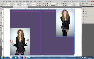
Step By Step Editing of Double Page Spread
Before writing the actual interview I thought that the text wouldnt show up very good against the purple background. However I still didn't want a bland white double page spread. So i decided to draw a a white box with the purple background, so that way the text would still be clear but also I have the edgy purple colour.
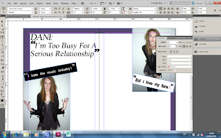
The next step I did was insert the headline to the spread. For the headline I used the font Times New Roman and the size was 60.
This is what my spread looked like with the headline on the page.
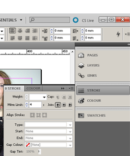
I then decided to change the colour of the text in the headline and also one of the quotes to give a wider variation of colour to the spread. To change the colour of the text I higlighted the text and pressed the stroke tool and changed the colour to red. This is what it looked like with the change in colour.
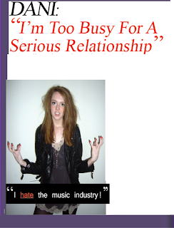
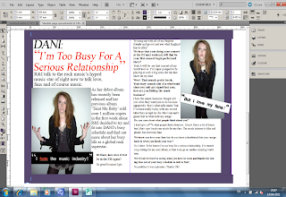
After that I wrote and inserted the interview, this is what it looked like after the text had been inserted. Around the purple boarder I decided to add some text to frame the spread. This is what it finally looks like.