I first started by opening the design I drew of the master head in Photoshop. This is going to be my first layer.
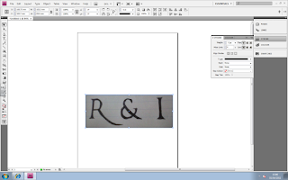 The next step that I did was I used the eraser tool around the edges of the design to get rid of the paper in the background of the design. This is what it looked like once I did this.
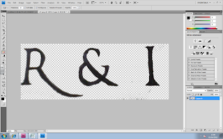 After that I stated to Make the edges look sharper and more even. This will make it look more professional. This is what it looked like after I did this process.
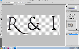 Next I wanted to make the colour of my Masterhead look like a solid black instead of just a biro black colour. I did this by using the ‘Brush Tool’ in black and started painting over the letters.
 Whilst I was painting over the letters I decided that I wanted to get the lines on the letters straight, so I used the 'Line Tool' which ensure that I got a straight line.
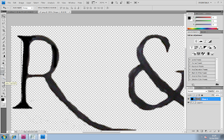
 I then drew the line next to the R and started to fill it in. Below is the screenshot of the 'R' Being filled in and the other not. You can already tell thatby doing this step it makes the letters look more solid and bold.
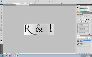
I repeated that step with the letter 'I' by again using the 'Line Tool' to make it even then filling it in with the 'Brush Tool'. The final step I did was sharpening the edges more and filling in the rest of the letters. I did this by using the 'Eraser Tool' and 'Brush Tool'. This is what my end Masterhead looks like.

No comments:
Post a Comment