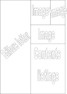
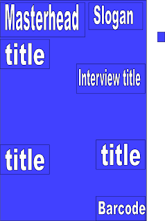
To make the process of putting my magazine pages together easier, I decided to plan out which elements i want where in my magazine.

Double Page Spread:
Front Cover:
I decided to make the background of my front cover the  picture from the shoot. This will show that the interview is the main focus of this magazine. The titles will surround the picture to ensure that the interview is still the main focus. I decided to put the Masterhead in the top left corner because that's what many magazines also do, and because when people read they start at the top right then read across, which is why the masterhead is postioned there.
 picture from the shoot. This will show that the interview is the main focus of this magazine. The titles will surround the picture to ensure that the interview is still the main focus. I decided to put the Masterhead in the top left corner because that's what many magazines also do, and because when people read they start at the top right then read across, which is why the masterhead is postioned there.
Contents Page:

Double Page Spread:

No comments:
Post a Comment