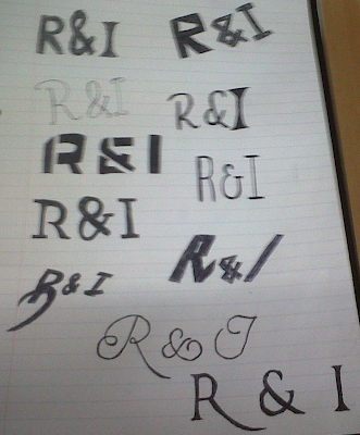
I began to play around with different font styles for my Master head. I drew 11 designs altogether and I drew these designs because i though that these would be most appropriate for my music magazine. Below is a short analysis for each design where I talk about how I think they work.
This two designs are in contrast to each other because the top one is heavier in thickness and has sharper lines compared to the other. The top one has also got a variation of heig
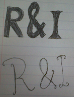
hts, the ‘&’ is bigger than the R and I. This represents that the ‘&’ is important and highlights that its not just a rock magazine but a Rock
& Indie magazine. The bottom one I don't think is appropriate because it looks to elegant and also looks unprofessional. I definitely prefer the top one out of the two designs.
These two designs are quite similar because they are both quite bold, how ever they have a couple of different properties. The top design has very sharp and blunt edges which I think represents the Rock genre, because the work rock represents blunt and hardness. However is doesn't represent Indie, which I think is hard to represent in font style. The bottom design has a sharp edge of the ‘I’ but not on the ‘R’ . However I think that if the letters are different in font it would show the difference in genre. However I think that the ‘R’ should be rougher the ‘I’ because rock music is a bolder genre than Indie. I also like the way the ‘&’ symbol looks on this design, I will definitely use this on my masterhead.
These two design s are very different because one looks quite modern and futuristic, while the other looks quite classical. The top design looks very modern and techno. I decided that this design would be good for my magazine because I think its very bold and would definitely stand out on the cover. However I don't think if people looked at it they would think that this is a Rock and Indie magazine. The bottom design is a development of the bottom design on the previous picture i decided to make the ‘R’ look more bold and sharp. I still don't think that the combination of those two look very eye catching, therefore I don't think it would be suitable.
These two designs are extremely contrasted in shape, thickness and alignment.  The top design is very thin and tall. I think that this font looks very gothic and very individual. However i don't think it would stand out against all of the other components of my front cover. The masterhead should be one of the main features in the page but I think if I used this one is would just blend into the background. The bottom design is very bold and sharp edge. Also unlike the other one it is slightly leaning to the right. This makes it look stylish and interesting. It would suit a rock magazine however I think that this font is too strong for an indie magazine.
This design is again very strong and bold. In my opinion this is again to strong for my aim of my magazine. I really like the extended ‘R’ at the bottom so in the next two designs I incorporated that idea into those.
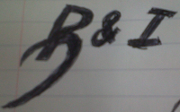
In the previous design I like the idea of the extended ‘R’ and decided that I wanted that to be incorporated into my master head. I also tried in these designs to not make them too bold but also intere

sting so it would stand out. The top design is not bold but it does have an interesting design. The design looks very gothic and old fashioned. I don't think this fits in with the Rock and Indie vibe. The bottom design is a perfect compromise between bold and thin. The thickness is medium. It looks quite classic and the style doesn't look like it could be outdated. The extended ‘R’ I think differentiates the two genres from each other because the ‘I’ looks differentiate but still fits into this overall design.
This is my overall Masterhead design, and i will now go further on to creating it in the program ‘In Design’. By doing this it will make it look more professional.

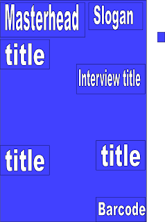
 I did this by drawing a text box with the text box tool, and then typing in what I wanted it to say. The font I used was Minion Pro and the text size was size 12. I use these because I think they looked very casual but also formal enough to be in a magazine.
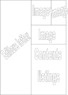
  After that I then filled in the contents at the bottom of the page and also matched the contents numbers to the pictures on the contents page. For the contents listing I used the same font as the editors letter which was Minion Pro. With the Title which says 'R&I this week' I also used the same font but a bigger size. For the words 'R&I' I made it bold, I did this by highlighting it and then pressing the bold letter tool.

 Before adding the masterhead to my photo, I wanted to change certain elements of this photo. I opened this picture in Photoshop and bega editing. I started with the small things such as red eye. I noticed that in the photo of Danielle the photo came out with red eye, I decided this obviously needed to be changed.
 To remove the red eye, I simply clicked the red eye tool and dragged it over her eyes which instantly made them go back to her orginial eye colour.
 I used the brush tool and zoomed into the hands and painted over the bright pink nail colour with a dark maroon colour. I choose this colour because the colour maroon is a dark red, and because when you think of red you think confident and sexy. The dark red represents the same ideas but has a dark edgy twist to it.


 I decided to choose this particular photo for my front cover because it looks tough and edgy. The pose and facial expression is relaxed and effortless, which makes it seem as if she doesn't care what she looks like. This will be the photo used on the front cover of my music magazine.


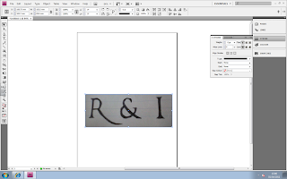 The next step that I did was I used the eraser tool around the edges of the design to get rid of the paper in the background of the design. This is what it looked like once I did this.
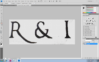 After that I stated to Make the edges look sharper and more even. This will make it look more professional. This is what it looked like after I did this process.
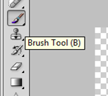
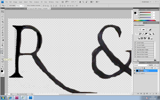
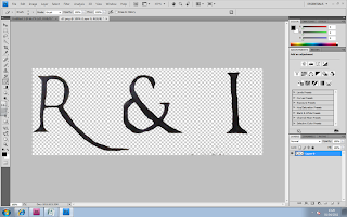 Next I wanted to make the colour of my Masterhead look like a solid black instead of just a biro black colour. I did this by using the ‘Brush Tool’ in black and started painting over the letters.
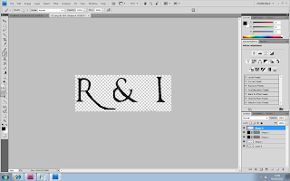
 Whilst I was painting over the letters I decided that I wanted to get the lines on the letters straight, so I used the 'Line Tool' which ensure that I got a straight line.
 I then drew the line next to the R and started to fill it in. Below is the screenshot of the 'R' Being filled in and the other not. You can already tell thatby doing this step it makes the letters look more solid and bold.


 For the double paged spread I want to use two contrasting pictures. I want to do this to show the audience t


 In the previous design I like the idea of the extended ‘R’ and decided that I wanted that to be incorporated into my master head. I also tried in these designs to not make them too bold but also intere
