
Comments from Audience 1
"I like the colours used throughout the magazine. I also feel as if I can look up to the artist featured. The colours andn artists the rock genre really well, but I dont really think I can see how Indie music is incorporated into it"
About Audience 1
Her name is Fiona, she is 17, loves going out to gigs,favourite music is indie/alternative music,lives in a small town.
Reflection on results from Audience 1
I asked Fiona to look at my magazine and fill out my feedback sheet because she's the type of audience that i'm aimed my magazine at. From these results I've found out although I incorperated the rock genre into my magazine, I havent done as much for Indie. I think that the style of my magazine (colour, masterhead) is in style as a rock magazine, however the artricles that it features focuses on both genres. Fiona also agreed that my front cover was the weakest element of my magazine, I'm disapointed in this because I feel as if I tried so hard to try and make it work, but I don't think it looks as professional as the other elements of my magazine. However she did say that she liekd tthe artist and felt that she could look up to her, I think that is a good result bercause many girls need role models to look up to.
Audience 2 Comments

"I love the conents and double page, because they look like you would actually see them in a proper magazine. The front cover is alright but I think its the colour or something that just isn't right with this front cover. I like the contents page becaue it actually made me wanna see some of the magazine articles, and I really like the interview because she seems like a well cool girl. But yeah overall I think its good."
About Audience 2
His name is David and he is 23, he lives in a small town, goes out clubbing and also is going to festivals this summer. Rock and dubstep are his favourite genre's music.
Reflection on Results from Audience 2
I decided to ask David for feedback because although hie like dubstep, he still liked rock msuic and is 23. This gives me the chance to find out about what people think who also have other music intrests and also in a higher age band. He also thinks that the front cover is not as strong as the other which I already know, but at least it shows that its not just me thinking that it doesn't look right. I think if I had more times I would definitly change my front cover. He talked about how he liked my contents page because it made him want to read the articles. This is good because thats what I wanted from the contents so that intrigues the audience to go and read the artcles. He also said how he like the artists, this is good because I wanted her to look edgy but also approachable and rewlatable to the audience.
Overall thoughts
Overall I think that although both audience aggreed that the front cover wasnt at the strongest, they both thought that the artist was relatable in some way. They also agreed that the text is as if they are talking to a friend and also think that the magazine represents the rock genre well, but maybe should incorperate the indie genre more. Overall I'm pleased with the feeback that I got because it helps me realise that what I've done wrong and understand how I could improve my magazine to be the best that I could make it.


 I have learnt so much through the duration of this project about technology. Before I started this project I would use Microsoft Publisher and Paint if I was ever going to do editing, however now I don’t think I could ever go back.


 BBC- Even though the BBC doesn’t have any magazines which are rock/indie magazine I think that my magazine wouldn’t be appropriate for the BBC brand.


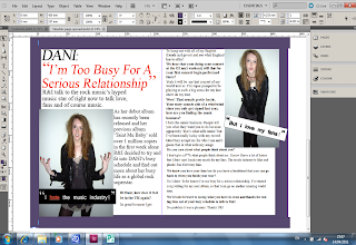
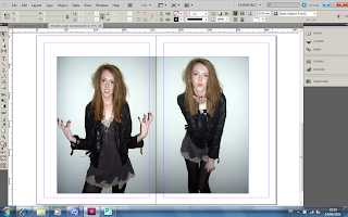 The next step I did was position the photo's where I wanted them and also set the background colour.
 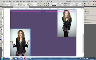 The next step I did was put the appropriate quotations next to the photo's on the document. To make the boxes around the quotations I clicked the 'Shape Tool' and drew a rectangle shape for the quote to go in.
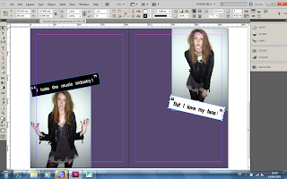 Before writing the actual interview I thought that the text wouldnt show up very good against the purple background. However I still didn't want a bland white double page spread. So i decided to draw a a white box with the purple background, so that way the text would still be clear but also I have the edgy purple colour.
 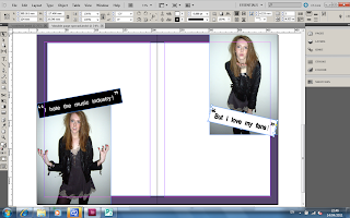 The next step I did was insert the headline to the spread. For the headline I used the font Times New Roman and the size was 60.
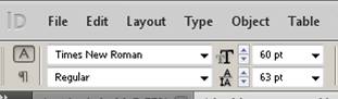 This is what my spread looked like with the headline on the page.
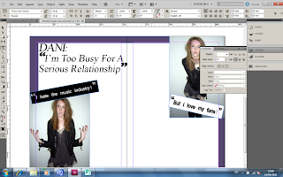 I then decided to change the colour of the text in the headline and also one of the quotes to give a wider variation of colour to the spread. To change the colour of the text I higlighted the text and pressed the stroke tool and changed the colour to red.
 This is what it looked like with the change in colour.
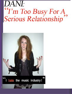
 Around the purple boarder I decided to add some text to frame the spread. This is what it finally looks like.
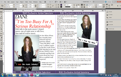
 I did this by drawing a text box with the text box tool, and then typing in what I wanted it to say. The font I used was Minion Pro and the text size was size 12. I use these because I think they looked very casual but also formal enough to be in a magazine.
  After that I then filled in the contents at the bottom of the page and also matched the contents numbers to the pictures on the contents page. For the contents listing I used the same font as the editors letter which was Minion Pro. With the Title which says 'R&I this week' I also used the same font but a bigger size. For the words 'R&I' I made it bold, I did this by highlighting it and then pressing the bold letter tool.

 Before adding the masterhead to my photo, I wanted to change certain elements of this photo. I opened this picture in Photoshop and bega editing. I started with the small things such as red eye. I noticed that in the photo of Danielle the photo came out with red eye, I decided this obviously needed to be changed.
 To remove the red eye, I simply clicked the red eye tool and dragged it over her eyes which instantly made them go back to her orginial eye colour.
 I used the brush tool and zoomed into the hands and painted over the bright pink nail colour with a dark maroon colour. I choose this colour because the colour maroon is a dark red, and because when you think of red you think confident and sexy. The dark red represents the same ideas but has a dark edgy twist to it.


 I decided to choose this particular photo for my front cover because it looks tough and edgy. The pose and facial expression is relaxed and effortless, which makes it seem as if she doesn't care what she looks like. This will be the photo used on the front cover of my music magazine.


 The next step that I did was I used the eraser tool around the edges of the design to get rid of the paper in the background of the design. This is what it looked like once I did this.
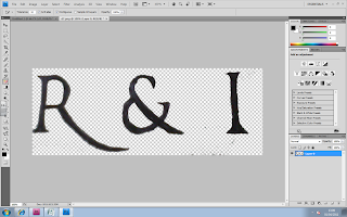 After that I stated to Make the edges look sharper and more even. This will make it look more professional. This is what it looked like after I did this process.
 Next I wanted to make the colour of my Masterhead look like a solid black instead of just a biro black colour. I did this by using the ‘Brush Tool’ in black and started painting over the letters.
 Whilst I was painting over the letters I decided that I wanted to get the lines on the letters straight, so I used the 'Line Tool' which ensure that I got a straight line.
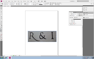
 I then drew the line next to the R and started to fill it in. Below is the screenshot of the 'R' Being filled in and the other not. You can already tell thatby doing this step it makes the letters look more solid and bold.

